Author:Melissa Bryant | TIME:October 14, 2019
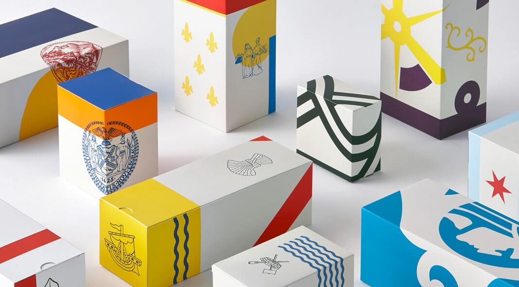
Have you noticed the magic of color? Believe or not, color has the power to affect you, both on emotion and behavior. Warm colors and cool colors could have an opposite effect on you. Let’s see how they can affect you.
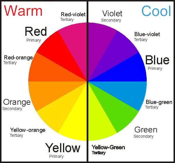
Warm colors include orange, red, yellow, and combinations of these and similar colors. These colors may make you unconsciously think of warm things like sunlight and heat. Warm colors are often associated with positive emotions, passion, energy, and joy. They can be stimulating, encouraging, and inspiring.
Cool colors consisit of blue, green, and light purple. These colors could remind you of water and sky, ice and snow, which gives them the capability to calm and soothe. In general, cool colors can make you feel calm, relaxed, salubrious as well as meditative.
The magic of color is also applicable to product packaging. We’ve explained that color has the power to affect your next move by giving you different emotional feelings. And matching well with the overall packaging style, it helps your product stand out from the competition.
Yes, choosing the right color or colors helps generate more leads, and thus more sales. Study has shown that packaging accounts for 80% of the buying decision, and the color of the packaging takes up 65% of that.
Now you should be aware of the importance and power of color, isn’t it high time you took the advantage of color psychology for your product’s packaging design?
So where to start? Which color(s) to choose? If you’d stop a while to brainstorm, you might have an idea of which color is the most striking and common. Right, it is yellow! Think of the highlighters, construction equipments, road signs and so on.
But wait, should you just choose yellow as the packaging color for your product simply because it can attract eyeballs more easily? For some of you, that’s ture; but for most of you, that would be a bad idea and could burn your marketing effort into ash.
There’s nothing wrong to drive more attention with noticeable color, but it is also very important to take into consideration that the packaging color should be aligned with the product as well as the packaging design. Always remember that product is the core, color is the stimulating element to success.
Actually there are some key factors that you should consider while choosing the right color for your packaging.
What your consumers need eventually is how your product helps them solve their problems. So the packaging color you choose should be able to deliver messages about the product. It may be something inspiring, fun, or comforting; it may be something associated with health and wellness; it may be something about value, etc. That depends on your product.
The color for your packaging design may be also based on your brand and its culture. Think of those giant brands such as Apple and Microsoft. So if you are opt for buiding a distinguishing brand, think about adding your brand color to the packaging.
 Competition
Imagine thousands of your rivals using the same or adjacent colors that you are going to pick for packaging, what extra effort will you have to make to stand out? So why not pick up something different? If your blue bottles of soda are among competitors’ yellow ones on the same shelf, you may have more than a double chance of purchase.
So before you make the final decision for the packaging color, it’s worthy to do a market research to get to know your competition. If possible, pay a visit to the grocery store, the boutique, the department store, and the flea market.
Apart from the color of the product and packaging bottles, containers, or jars, it’s also important not to neglect coordinating the color of the closure, the print and the label. It doesn’t have to be a colorful packaging, sometimes one single color can also make a big difference.
Just make sure the overall design looks good. This can be achieved with either analogous or or complementary colors.
Analogous colors are two colors that are adjacent to each other on the color wheel - this creates a harmonious combination.
Complementary colors are two colors that are on the opposite ends of the color wheel - this forms a sharp contrast that could catch more eyeballs.
Depending on your product type, the packaging color for your product should be various. In general, color for food packaging can be different from that for cosmetic or pharmaceutical packaging.
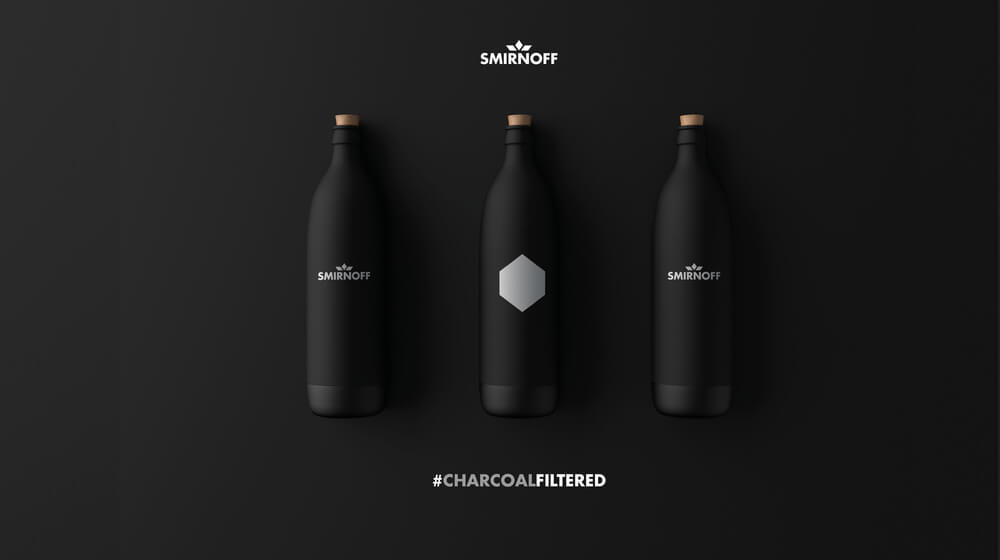
Black is the color stands for power and authority. It conveys a sense of escalated value and envokes class and elegance - thus it’s often applied in high-end products of clothing and fashion. In addition, black is also a ultimate neutral color representing simplicity, minimalism and masculinity.
The color white symbolizes purity, innocence and simplicity. And it delivers a message to consumers that the product is classic, simple and safe. Apple is the master of making full use of white, which is in line with the company’s concept of simplicity.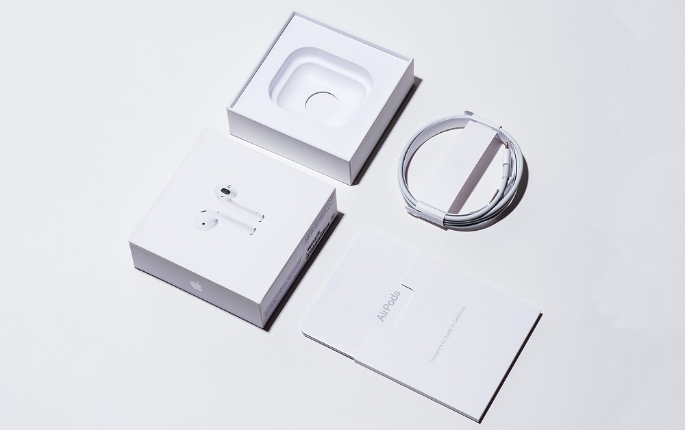
Red is always associated with passion, enthusiasm, strength, energy, and love. This is a bright color that is easily noticed. Red is widely used for food to stimulate appetite - think of the sauce and chili. 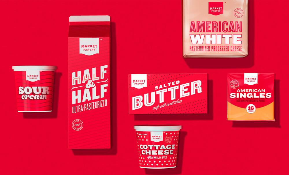
Blue signifies strength, harmony, honesty, and dependability. It is the most popular and the most gender generic color. Blue is calming and relaxing but can also refer to cold, uncaring or depressing. To the opposite of red, blue is an appetite suppressant.
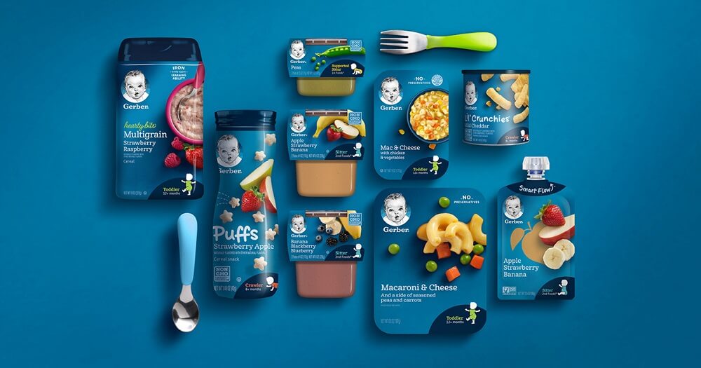
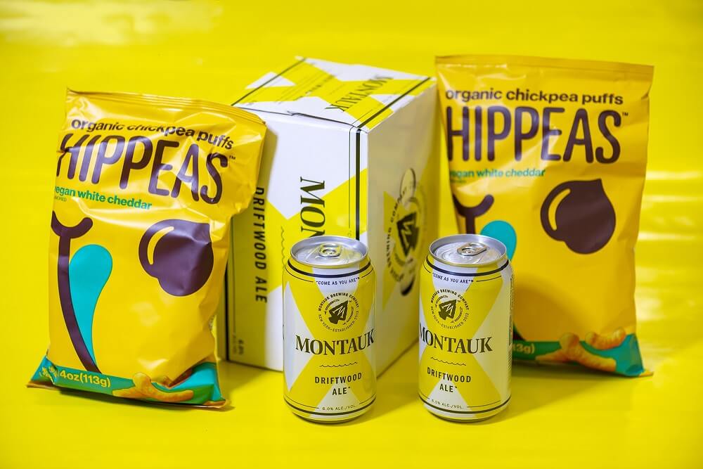
Yellow is a cheerful color that conveys fun, happiness, optimism and uplifting. When it comes to product packaging, yellow can mean innovation and origniality. Therefore, yellow packaging is most often targeted at children and adolescents.
Green is a calming and refreshing color that conveys a sense of safety, growth, health, harmony, sustainability, relaxation, and peace. It is most seen in things related with environment protection, and that’s why it’s the ideal packaging color for eco-friendly products.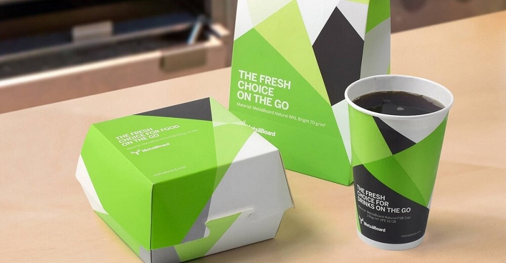
Pink is typically related with beauty, sincerity and empathy, thus it is a more feminie color. While being used for product packaging, pink is also mainly aimed at females. It is the best color for beauty and cosmetic product packaging.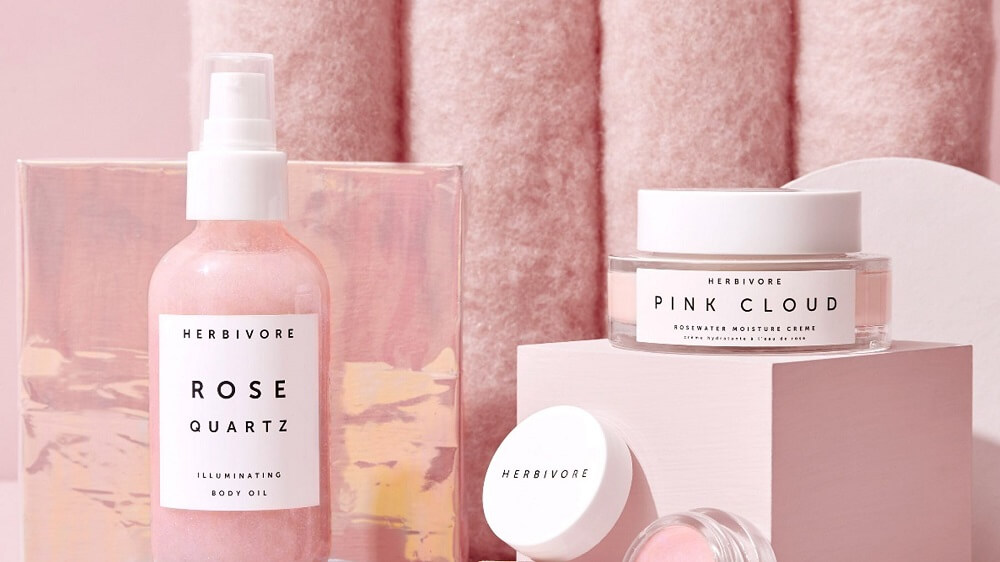
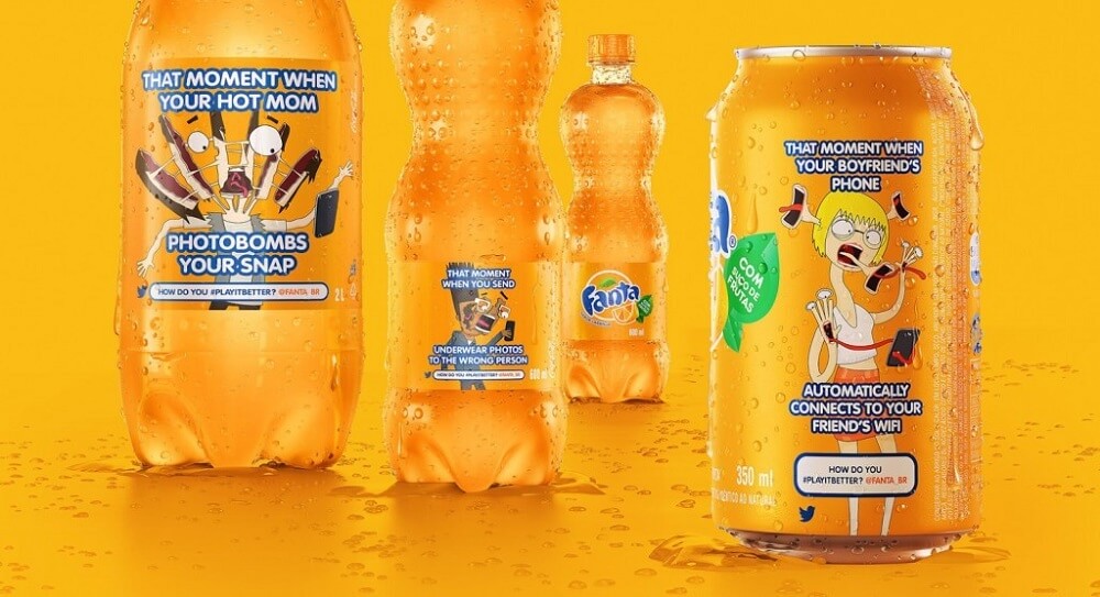
Orange conveys fun, creativity, adventure, and optimism. However, this color can also be sometimes associated with the opposite meanings with the mixed application of shades. So there is a uncertain risk to use yellow for product packaging, if it’s not well balanced.
Purple is associated with luxury, indulgence, as well as elegance. Paired well with gold or silver embellishments, this color creates a sense of nobility and high quality. Purple can also be a romantic color - think of the package of famous chocolate brand - Dove.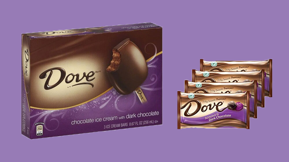
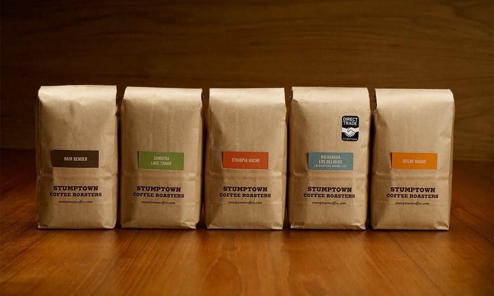
Brown conveys reliability and stability and evokes the sense of wholesomeness, nature, order, health and vitality. On the contrary, brown can also mean somber or wistful. Light brown can be lighthearted, while dark brown could be somber.
I hope above info about color psychology for product packaging design is useful and inspiring to you. Having an overall understanding of psychology of color and then taking the advantage of it could help pave the path of your marketing and brand building. And wish you a great success!